
Why Your Website Needs a Design System (and How to Build One in a Weekend)
Design teams with a system ship 38% faster. Here's how to build a lean design system with just five colors, a type scale, and CSS custom properties, in one weekend.
Most founders hear "design system" and picture a Figma file with 400 components, a team of five, and six months of runway dedicated to button states. That's not what I mean. What I mean is a handful of decisions, written down, that stop you from making the same call twice.
Design teams with a system increase project efficiency by 38%, and development teams see a 31% boost (Netguru, 2024). Those gains aren't reserved for enterprise teams. A lean design system has three things: a color palette, a type scale, and a spacing rule. Everything else is optional until it's obviously needed.
What Is a Design System?
A design system is a single source of truth for how your product looks and behaves. According to the Nielsen Norman Group, it's "a set of standards to manage design at scale by reducing redundancy while creating a shared language and visual consistency." In practice, it connects three layers: design tokens (your values), components (your building blocks), and documentation (your rules).
Don't confuse it with a style guide or a component library. A style guide tells you what shade of blue to use. A component library gives you a pre-built button. A design system ties both to your codebase and documents when to use each piece, plus how the system grows over time.
Here's the part most articles skip. Sparkbox's Design Systems Survey found that 52% of organizations say lack of adoption is the primary reason their design system fails. The system itself isn't the hard part. Getting your team to actually use it is. That's why starting small matters more than starting comprehensive.
Why Does Your Website Need a Design System?
Consistent brand presentation increases revenue by 23% on average (Demand Metric, 2019). Yet 95% of organizations have brand guidelines while only 25-30% actively enforce them. A design system closes that gap by making consistency the default, not the aspiration.
Without a system, every page your team builds is a fresh set of decisions. What gray should this border be? Is the heading 24px or 28px? Should the button have 12px or 16px padding? Multiply those micro-decisions across a product and you're burning hours on choices you've already made before.
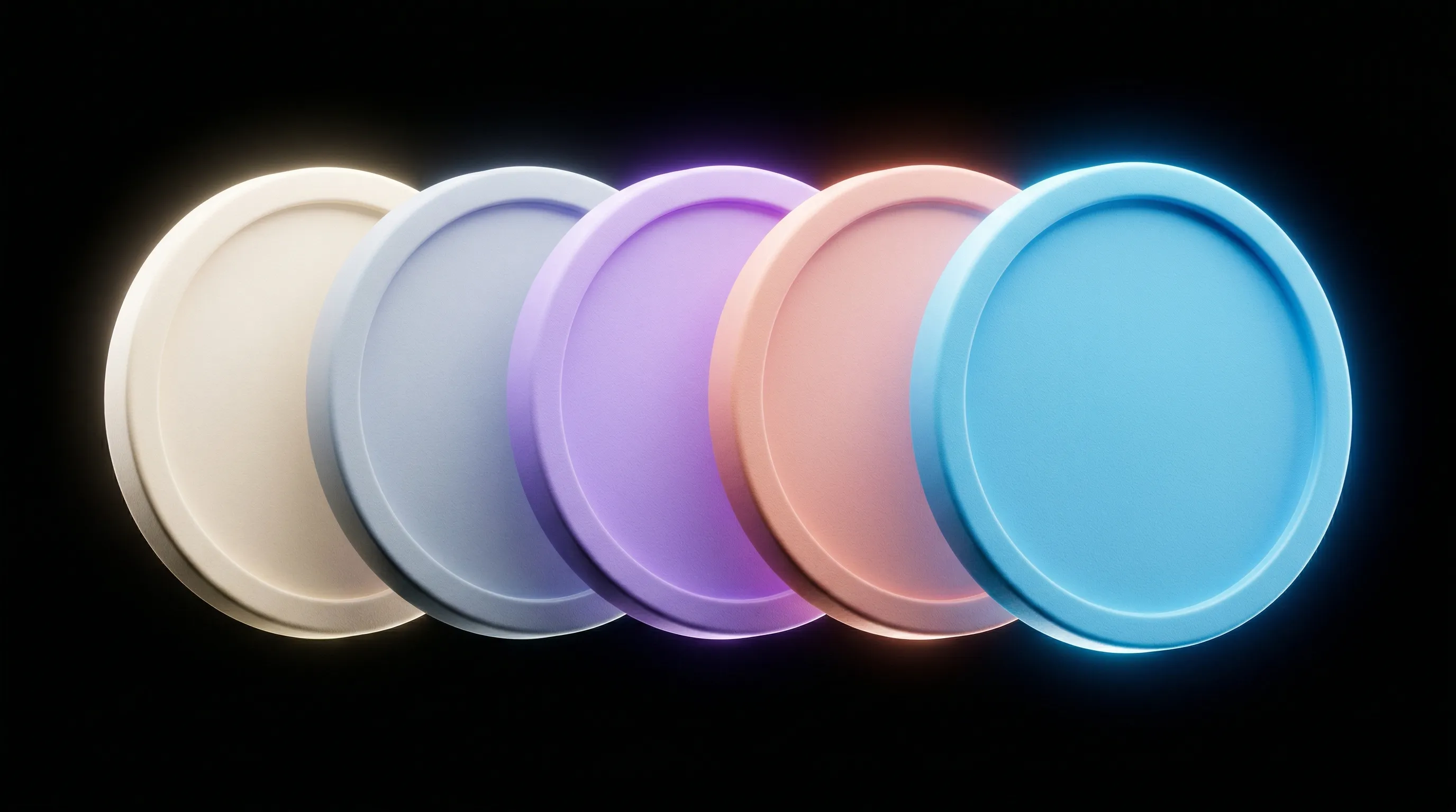
How to Build Your Website Color Palette
Brands that maintain visual consistency across all touchpoints see revenue increases between 23% and 33% (Demand Metric / Marq). Your color palette is where that consistency starts. And you need far fewer colors than you think.
Five colors will ship a real site: a background, a body text color, a heading text color, a border, and an accent. That's it. The accent does the heavy lifting for CTAs, highlights, and hover states. Keep it singular and make it distinctive.
Start with your neutrals. An off-white, a near-black, two or three grays of increasing darkness. The palette should feel complete before you introduce any accent color. If your accent could only exist on a screen, if you couldn't put it on a poster, a jacket, or a street sign, be skeptical of it.
On Brand Colors
Your logo color and your accent color can be the same, but they don't have to be. Often there's a version of your brand color that works beautifully at logo scale but feels aggressive at button scale. The token system is where you make that distinction explicit.
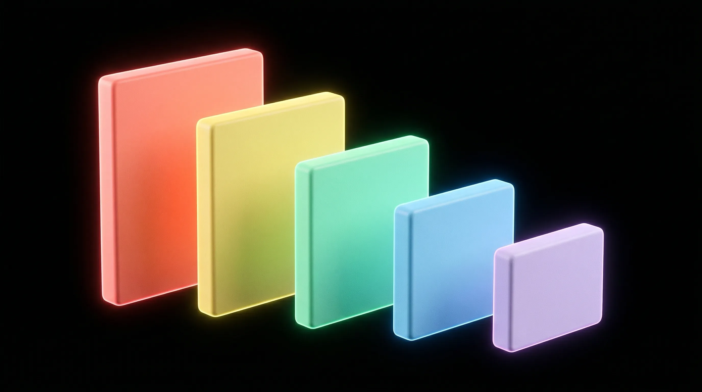
How to Choose a Typography Scale
Typography hierarchy directly affects how users scan and comprehend your content. Pick a base size (16-17px), then define five levels: display, heading, subheading, body, and caption. You don't need ten steps. Five is enough. Apply them consistently and the hierarchy reads itself.
Here's the insight most typography guides miss: weight contrast matters more than size contrast. A 48px regular-weight headline competes with a 17px bold subheading. A 48px bold headline paired with a 13px medium-weight label gives you an instant hierarchy, even at a glance.
What Are Design Tokens and Why Do They Matter?
Design tokens are the atomic values of your design system: colors, spacing, typography, border radius, and shadows stored as platform-agnostic variables. In 2025, CSS custom properties form the foundation of scalable design systems, dynamic theming, and consistent UI architecture across products.
The key distinction is between primitive tokens and semantic tokens. Primitive tokens are raw values. Semantic tokens describe intent. When your brand evolves, or when you add dark mode, you change primitive values in one place and every semantic token updates automatically. That's the difference between a 20-minute theme change and a week-long find-and-replace hunt.
How to Build a Design System in a Weekend
Saturday morning: audit. Open your codebase, your Figma file, or your CSS and document what already exists. Note every color value that appears more than twice. Note every font size. Note every spacing value. You're not redesigning anything. You're cataloging decisions you've already made.
Saturday afternoon: consolidate. Merge similar values. Define your five colors and five type sizes as CSS custom properties. Add a spacing scale (4px base with multipliers: 4, 8, 12, 16, 24, 32, 48). Wire them in.
Sunday: apply and clean up. Replace every hardcoded value in your codebase with a token reference. Remove anything that doesn't use a variable. You'll find edge cases. That's the system telling you it needs another token, not that the system is failing. By Sunday evening you have a real design system. Not a beautiful one, but an operational one. And operational wins every time.
Design System Examples Worth Studying
Material Design (Google). The most widely adopted design system in the world. Material 3 introduced dynamic color theming and an extensive token architecture. Best for teams that want comprehensive guidance on every interaction pattern.
Carbon Design System (IBM). A mature, accessibility-first system with strong documentation and a clear token hierarchy. Carbon is a good model for teams that prioritize accessible, enterprise-grade interfaces.
Tailwind CSS. Not a design system by itself, but the most popular CSS framework in 2025, used by 37% of developers (Tailkits, 2025). Tailwind's utility classes and default configuration function as a design system foundation. Many custom systems are built on top of it.
shadcn/ui. A component collection built on Tailwind and Radix primitives. It's not installed as a dependency. You copy the source code into your project and own it. This approach is ideal for solo founders or small teams who want a head start without vendor lock-in.
Frequently Asked Questions
What is a design system?
A design system is a set of reusable components, design tokens, and documentation that governs how a product looks and behaves. It connects your design decisions (colors, spacing, typography) to your codebase through shared variables, creating a single source of truth that reduces inconsistency and speeds up development.
How many colors do I need in a design system?
Five colors will get you surprisingly far: a background, body text, heading text, a border color, and one accent. The accent handles CTAs, hover states, and interactive elements. Start with your neutrals first. The palette should feel complete before you add any color.
Do startups or small teams actually need a design system?
Yes. The moment two people are making design decisions, inconsistencies multiply. A lean system, five colors, a type scale, spacing tokens, takes a weekend to build. Sparkbox's survey found the top success factor is making the system part of daily workflow, not its size. A small, used system beats a large, ignored one.
What's the difference between design tokens and CSS variables?
CSS custom properties (variables) are one implementation of design tokens. Design tokens are the concept: platform-agnostic values that define your visual language. CSS variables are how you implement them on the web. Tokens can also be exported to iOS (Swift), Android (XML), or design tools through tools like Style Dictionary.
Can I use Tailwind CSS as my design system?
Tailwind provides a strong foundation with its default color palette, spacing scale, and typography sizes. For solo founders or small teams, Tailwind's configuration file is your design system. As your product grows, you can extend it with semantic tokens and custom components built on top of the utility classes.
How do I get my team to actually use the design system?
Start by documenting the decisions your team already makes repeatedly. If the system reflects how people already work, adoption is natural. The 52% failure rate from Sparkbox's data isn't about bad components. It's about teams that build systems nobody asked for. Ship the smallest useful piece, then grow it based on real friction.
A design system isn't a deliverable. It's a way of working. Ship the smallest useful piece, then add to it as you encounter real problems.

Jon Sorrentino
Jon Sorrentino is a fractional design partner with digital product and brand experience at PepsiCo, VICE Media, and Barstool Sports. He runs a solo design studio working with Series A and B startups on product design, web design, and brand strategy. He enjoys writing about the intersection of AI and Design and the decisions that separate good design from design that performs for businesses.
Want help building this out for your site? I work with founders and small teams to get the fundamentals right, fast.
Let's talk