
11 Best Adobe Portfolio Examples for Graphic Designers (2026)
11 top examples of graphic design portfolios on Adobe Portfolio that will give you the blueprint to building a stunning graphic design portfolio website.
Most designers underestimate what Adobe Portfolio can actually do.
It comes free with Creative Cloud, it takes less than a day to set up, and when used well — it produces portfolio websites that get designers hired and win clients. The proof isn't theoretical. It's in the portfolios below.
I've reviewed hundreds of design portfolio websites over the years. The ones that work aren't always the most technically complex. They're the ones where the designer made intentional decisions — about what to show, how to show it, and what to leave out. Adobe Portfolio gives you enough control to make those decisions count.
These 11 examples are the best I've found. For each one I've included the Adobe Portfolio theme used, what makes it work, and the one thing you should steal for your own portfolio.
Best Adobe Portfolio Examples for Graphic Designers
1. Julius Cruickshank
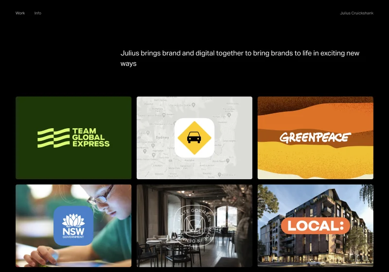
Adobe Portfolio Theme: Ludwig
Julius's portfolio is a clinic in restraint. Rounded project thumbnails sit in a clean grid, carefully spaced so nothing competes for attention. The homepage communicates taste before you've clicked a single project.
His project pages use multiple column layouts with generous negative space — a combination that slows the viewer down and gives the work room to breathe. Typography is intentionally neutral, which is exactly the right call when the work is this strong.
What to steal: The thumbnail spacing. Most designers cram too much onto their homepage. Julius proves that the white space between projects is doing as much work as the projects themselves.
2. Max Ayalla
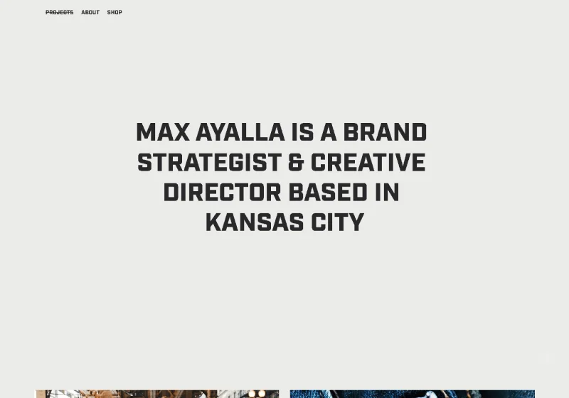
Adobe Portfolio Theme: Marta
Max is a creative director who has worked with Nike, Hurley, and Under Armour — and his portfolio signals that immediately. Bold type hits you on arrival. Vibrant thumbnails communicate energy and range before you read a single word.
The detail that sets it apart: a subtle strikethrough hover effect on project titles. It's small, unexpected, and memorable. In a sea of identical portfolio grids, that kind of interaction tells you there's a real designer behind the work.
What to steal: One unexpected micro-interaction. You don't need a complex custom site to add personality — one well-placed hover effect does the job.
3. Nora Kaszanyi
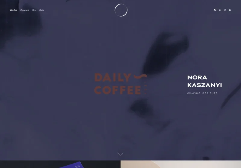
Adobe Portfolio Theme: Marta
Nora's portfolio opens with a video reel header — the single most effective thing you can add to an Adobe Portfolio homepage if your work has motion in it. It communicates range, quality, and professionalism in the first five seconds.
Beyond the hero, Nora's About page is one of the best I've seen on any platform. It goes beyond a bio to include press features, accolades, and client work — built as a page that actively sells her, not just describes her.
What to steal: Treat your About page like a credentials page, not a biography. Nora's About page is doing serious conversion work that most designers leave entirely to their homepage.
4. Romain Ferrer
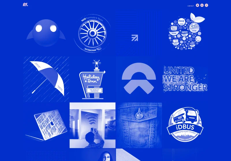
Adobe Portfolio Theme: Thomas
Romain commits to a bold monochromatic blue across every element of his site — and it works because it's consistent. The hover state reveals pastel pink accents, which creates a moment of visual surprise that keeps visitors engaged. Drop shadows on project images add depth without clutter.
This portfolio demonstrates something important: a strong color decision applied consistently does more for your brand than a dozen different design choices applied inconsistently.
What to steal: Pick one brand color and run it through everything — background, nav, accents. Romain shows what happens when you commit fully rather than hedge.
The best adobe portfolio resource ever made.

Download Your Copy Today →Download Your Copy Today ↓
Stop Googling
“Adobe Portfolio Examples.”
I found 40 of the best ones just for you.
- 40 real professional portfolios
- Home, About, Project Pages Inc.
- One focused theme per site
- 40x Steal-This Ideas
- Free — instant delivery
- Branding
- UX + motion
- 3D + illustration
- Photography
- Editorial
- Real designer testimonials
- Any Creative Cloud plan
- Instant delivery
- Unsubscribe anytime
- 40 real professional portfolios
- Home, About, Project Pages Inc.
- One focused theme per site
- 40x Steal-This Ideas
- Free — instant delivery
- Real designer testimonials
- Any Creative Cloud plan
- Branding
- UX + motion
- 3D + illustration
- Photography
- Editorial
- Instant delivery
- Unsubscribe anytime
5. Bita Goli
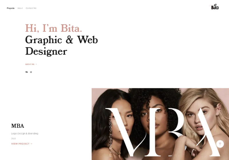
Adobe Portfolio Theme: Andreas
Bita's portfolio is a masterclass in using Adobe Portfolio's layout options intentionally. Alternating thumbnail layouts give the homepage rhythm so it reads as curated rather than dumped. Left-aligned text adds structure. Hover states reveal secondary images, adding depth without requiring any custom code.
High-quality thumbnails carry the whole thing. This portfolio is a reminder that no theme decision matters more than the quality of the images you put in it.
What to steal: Secondary hover images on project thumbnails. Adobe Portfolio supports this natively and almost nobody uses it — it adds a layer of interactivity that makes your grid feel alive.
6. Ragnar Freyr
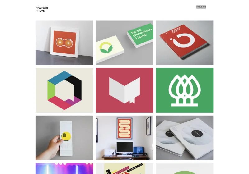
Adobe Portfolio Theme: Thomas
Ragnar is an icon designer and illustrator, and his portfolio understands that completely. The thumbnails don't just show his work — they are his work. Every image on the homepage is so visually distinctive that you recognize his style before you've read his name.
His project descriptions are minimal by design. When your visual language is this strong, words get out of the way.
What to steal: Let your thumbnail images do the positioning work. If someone can tell what kind of designer you are and who you design for from your grid alone, you've done your job.
7. Jacob Tejlmand
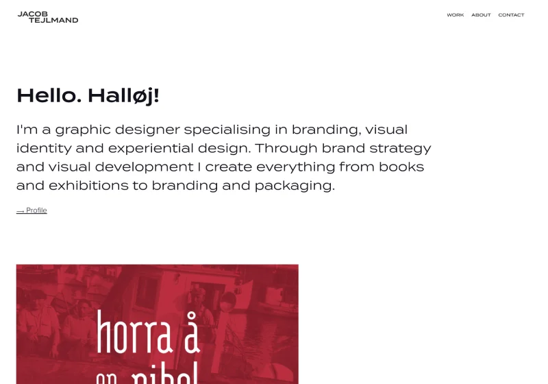
Adobe Portfolio Theme: Thomas
Jacob's homepage shows exactly three projects. That's it. It's one of the most confident portfolio decisions you can make — and it pays off. Three strong, curated projects tells a hiring manager or client that you know what your best work is and you're not afraid to own it.
His About page uses a multi-column layout that balances bio, philosophy, and services without feeling cluttered. It's organized like a designer built it, not like someone filled in a form.
What to steal: The confidence to cut. If you have 20 projects in your portfolio, you probably have 3 great ones. Build around those.
8. Madison Shackell-York
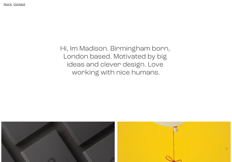
Adobe Portfolio Theme: Lukas
Madison's portfolio is clean and direct — a curated thumbnail grid that steps out of the way and lets the work speak. But the project pages are where it earns its place on this list. High-resolution headers, varied layouts across each case study, and a clear sense of visual storytelling inside each project.
Most designers build a strong homepage and then let the project pages fall flat. Madison does the opposite — the project pages are the product, and they're treated that way.
What to steal: Invest as much time in your project pages as your homepage. The hiring manager who clicks through is already interested — your project page is what closes them.
The best adobe portfolio resource ever made.
Download Your Copy Today →Download Your Copy Today ↓
Stop Googling
“Adobe Portfolio Examples.”
I found 40 of the best ones just for you.
- 40 real professional portfolios
- Home, About, Project Pages Inc.
- One focused theme per site
- 40x Steal-This Ideas
- Free — instant delivery
- Branding
- UX + motion
- 3D + illustration
- Photography
- Editorial
- Real designer testimonials
- Any Creative Cloud plan
- Instant delivery
- Unsubscribe anytime
- 40 real professional portfolios
- Home, About, Project Pages Inc.
- One focused theme per site
- 40x Steal-This Ideas
- Free — instant delivery
- Real designer testimonials
- Any Creative Cloud plan
- Branding
- UX + motion
- 3D + illustration
- Photography
- Editorial
- Instant delivery
- Unsubscribe anytime
9. Sebastian Onufszak
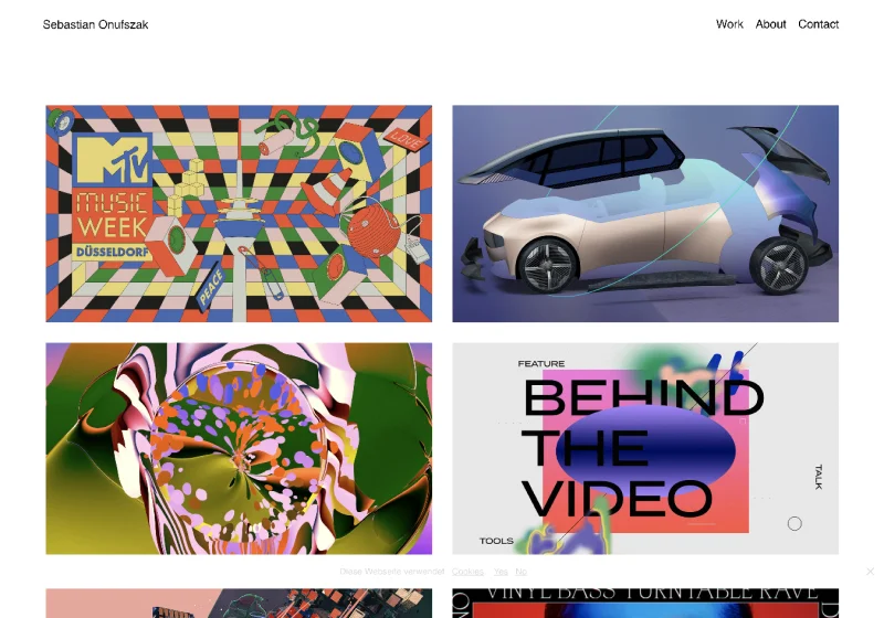
Adobe Portfolio Theme: Thomas
Sebastian is an award-winning illustrator and art director, and his portfolio makes a choice that most designers get wrong: the site itself is restrained so the work can be loud. Minimal UI, clean navigation, no decorative elements competing for attention — and then the projects hit you like a freight train.
The contrast between the quiet container and the bold, experimental work inside it is the design decision. That tension is what makes it memorable.
What to steal: Design your portfolio around your work's personality, not your own. If your work is loud, your site should be quiet. If your work is minimal, your site can have more presence.
10. Paul Kirschvink
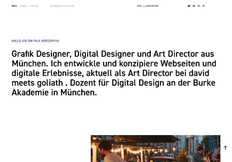
Adobe Portfolio Theme: Andreas
Paul's portfolio has a distinctly European design sensibility — strong type hierarchy, structured grids, everything in its place. His project pages use photo grids and strategic headings to walk the viewer through process and context, not just finished work.
This is an important distinction. Showing finished work tells a client what you made. Showing process tells them how you think. Paul's portfolio does both.
What to steal: Add at least one process section to each project page. Even two or three images of sketches, iterations, or intermediate steps transforms a gallery into a case study.
11. John Olson
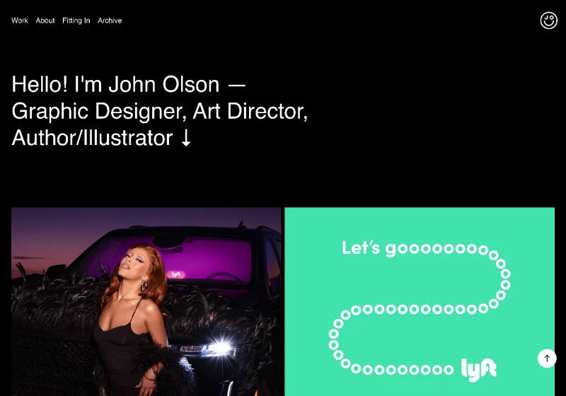
Adobe Portfolio Theme: Marina
John's portfolio is built around large-scale, high-resolution imagery from his work at Lyft — and that scale alone communicates confidence. His project pages mix mockups, photography, and art direction in a way that shows range within a single body of work.
The lesson here isn't about the theme or the layout. It's about image quality. Everything on John's site is shot or exported at a resolution that commands respect. That decision alone elevates the entire portfolio.
What to steal: Before you optimize anything else about your portfolio, optimize your image quality. Compress for web, but never at the expense of clarity. Blurry or low-res images undermine even the strongest work.
What These Adobe Portfolio Examples Have in Common
After looking at dozens of the best Adobe Portfolio websites, a few patterns show up consistently in the ones that actually work:
They made a theme decision and committed to it. Every portfolio above picked a theme and used it with intention — not as a default, but as a creative choice. The Thomas theme appears five times on this list because it's the most flexible, but the designers using it made it look completely different from each other.
They treated thumbnails as a first impression. Your project grid is your handshake. Every designer on this list invested in thumbnail quality — the right crops, the right resolution, images that communicate the work at a glance.
They curated, they didn't dump. None of these portfolios show everything the designer has ever made. They show the best of what they want to be hired to do more of.
Their project pages go deeper than the grid. The homepage gets the click. The project page closes the conversation. The strongest portfolios on this list treat project pages as the real product.
Ready to Build Yours?
If these examples have you ready to launch your own Adobe Portfolio — good. That's the point.
The platform is already sitting in your Creative Cloud account. The designers above aren't using anything you don't have access to. The difference is knowing how to set it up the right way from the start.
I put together a mini course that walks you through the entire Adobe Portfolio setup — from picking the right theme for your work to getting your site live — with the goal of having your portfolio up within 24 hours of starting.
Get the Adobe Portfolio mini course →
And if you want to understand the platform in more depth before diving in, start with my full Adobe Portfolio review — an honest breakdown of what it does well and where to set your expectations.
Looking for more portfolio inspiration? Check out the best Adobe Portfolio themes to find the right starting point for your work.

Jon Sorrentino
Jon Sorrentino is a fractional design partner with digital product and brand experience at PepsiCo, VICE Media, and Barstool Sports. He runs a solo design studio working with Series A and B startups on product design, web design, and brand strategy. He enjoys writing about the intersection of AI and Design and the decisions that separate good design from design that performs for businesses.
Want help building this out for your site? I work with founders and small teams to get the fundamentals right, fast.
Let's talk