
7 Best Adobe Portfolio Examples for Photographers (2026)
7 top examples of photography portfolios on Adobe Portfolio. Commercial, landscape, wildlife, fashion, and architectural photographers, with the theme used and what to steal from each.
Most photographers who use Adobe Portfolio are leaving the platform's best features completely untouched.
Adobe Portfolio comes free with Creative Cloud, takes less than a day to set up, and when used well produces portfolio websites that win clients and land representation. The proof isn't theoretical. It's in the portfolios below.
I've reviewed hundreds of photography portfolio websites over the years. The ones that actually work aren't always the most polished. They're the ones where the photographer made a specific decision about how to present their work, and then committed to it. Adobe Portfolio gives you enough control to make those decisions count.
These 7 examples are the best I've found. For each one I've included the Adobe Portfolio theme used, what makes it work, and the one thing worth stealing for your own photography portfolio.
Best Adobe Portfolio Examples for Photographers
1. Hugo Ceneviva
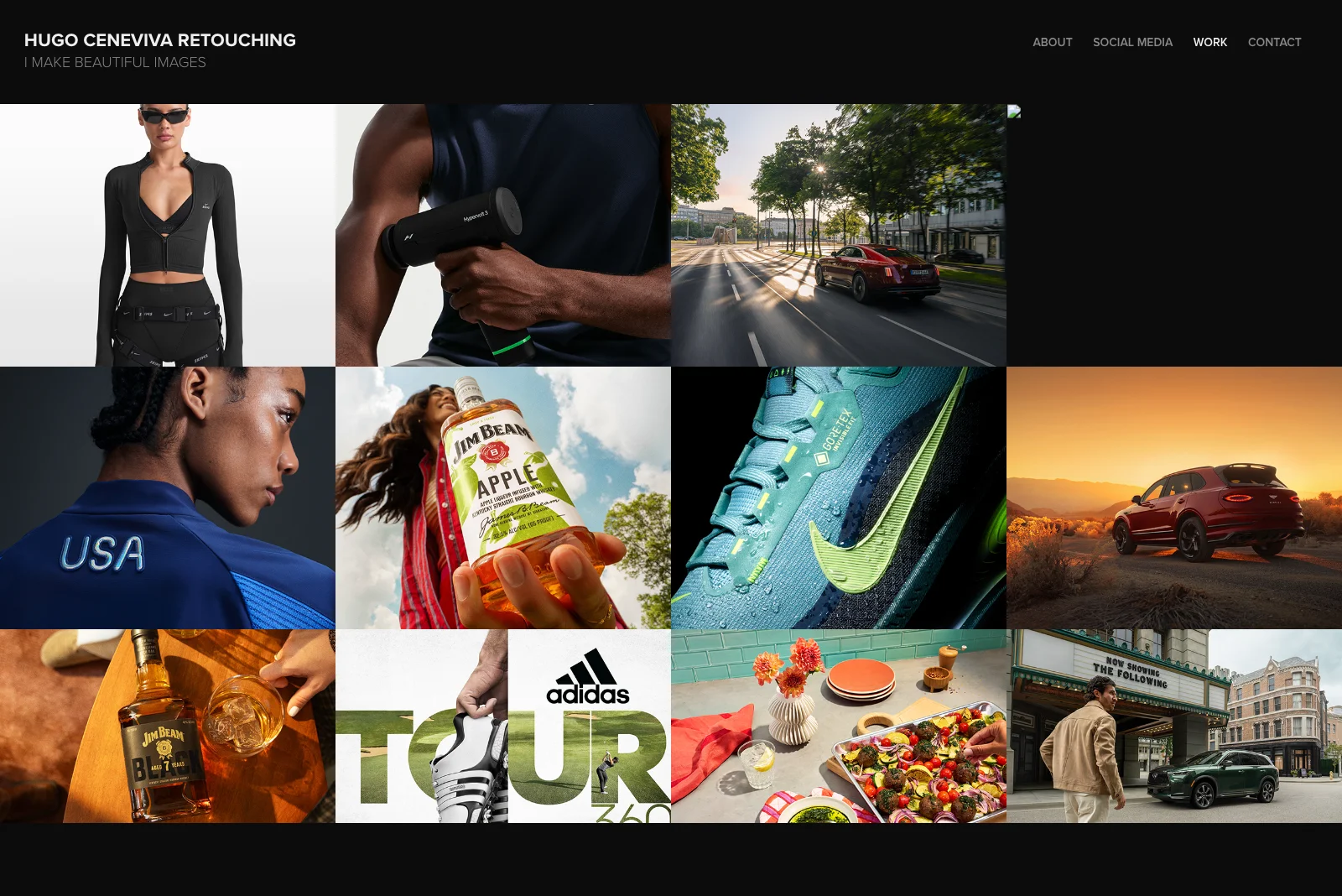
Adobe Portfolio Theme: Thomas
Hugo is a commercial retoucher whose client list reads like an advertising brief: Nike, Rolls Royce, Jim Beam, Adidas, Infiniti. His portfolio makes one design choice that most photographers get wrong, and it pays off immediately. He uses dark backgrounds instead of white.
The dark canvas changes the relationship between the viewer and the images. Product photography, automotive work, and fashion imagery all read differently against a dark background. They look more like campaigns and less like stock photos. Every image on the homepage feels like it belongs in a magazine spread.
His navigation is minimal and his project titles are descriptive without being clever. This is a portfolio that respects the viewer's time and trusts the work to do the talking.
What to steal: Try a dark background if your work skews toward commercial, product, or studio photography. The default white background works fine. Dark works better when the images were designed for it.
2. Don Davies
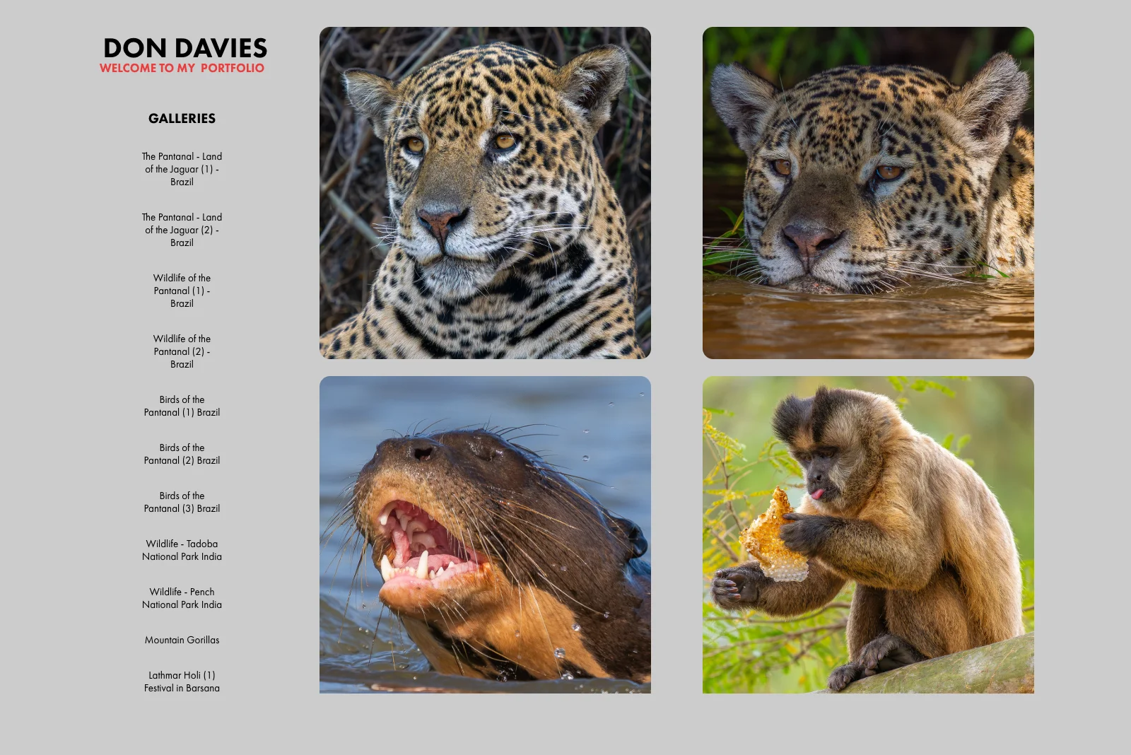
Adobe Portfolio Theme: Sawdust
Don photographs wildlife and travel across India, Uganda, and Brazil's Pantanal. Tigers, snow leopards, mountain gorillas, birds. His portfolio earns its place on this list not because of a clever design trick but because of one structural decision: every project card carries location and date metadata beneath the thumbnail.
That context is doing more work than it looks like. "Ladakh, India. September 2024." "Uganda. Mountain Gorillas." Before you've clicked a single project, you know this is a photographer who goes where the work is. The metadata positions Don as someone with range and dedication before he's said a word.
This is the quiet argument for showing your work's context, not just the work itself.
What to steal: Add location and date metadata to your project cards. Adobe Portfolio supports this natively. For travel, documentary, or nature photographers it signals credibility faster than any bio paragraph can.
3. Pablo Castro
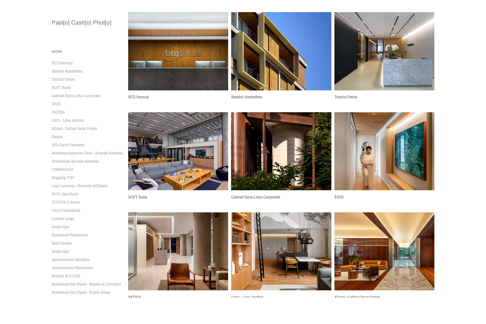
Adobe Portfolio Theme: Sawdust
Pablo shoots architectural and interior photography across Brazil and Spain. Luxury hotels, corporate offices, residential spaces, high-end showrooms. His homepage communicates all of that before you read a single sentence of copy.
The grid works because every thumbnail is the same type of shot. Architectural lines, controlled lighting, interior spaces. There is no visual noise from unrelated work. Pablo has made the decision to show only what he wants to be hired to shoot more of, and the result is a portfolio that feels like a specialty practice rather than a generalist's reel.
The photography does the work. The design stays out of the way.
What to steal: Edit ruthlessly toward your specialty. If you want to shoot architecture, show only architecture. A portfolio with 8 focused images in one discipline is more convincing than 40 images spread across everything you've ever shot.
The best adobe portfolio resource ever made.

Download Your Copy Today →Download Your Copy Today ↓
Stop Googling
“Adobe Portfolio Examples.”
I found 40 of the best ones just for you.
- 40 real professional portfolios
- Home, About, Project Pages Inc.
- One focused theme per site
- 40x Steal-This Ideas
- Free — instant delivery
- Branding
- UX + motion
- 3D + illustration
- Photography
- Editorial
- Real designer testimonials
- Any Creative Cloud plan
- Instant delivery
- Unsubscribe anytime
- 40 real professional portfolios
- Home, About, Project Pages Inc.
- One focused theme per site
- 40x Steal-This Ideas
- Free — instant delivery
- Real designer testimonials
- Any Creative Cloud plan
- Branding
- UX + motion
- 3D + illustration
- Photography
- Editorial
- Instant delivery
- Unsubscribe anytime
4. Randy Wentzel
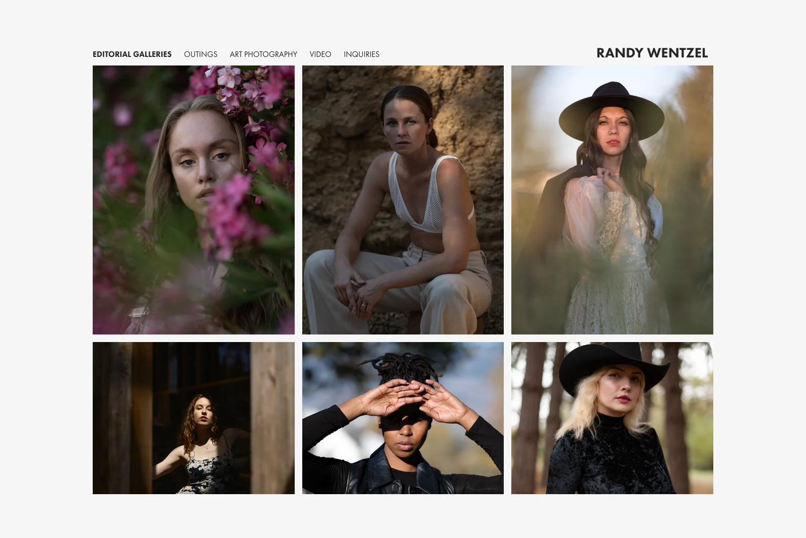
Adobe Portfolio Theme: Thomas
Randy shoots fashion, portrait, and editorial work out of Sonoma County, California. His portfolio makes a small structural choice that adds significant value to the browsing experience: every project preview shows two images instead of one.
Paired thumbnails communicate more than single shots can. Two images tell a story about range within a project. They show the relationship between images, the consistency of light or mood across a shoot, and the editorial thinking behind the work. You understand what kind of photographer Randy is before you've clicked through to a single project page.
The grid reads with rhythm as a result. Pairs create visual anchors that pull you through the page rather than letting your eye bounce around randomly.
What to steal: Use paired thumbnails if your work is editorial or fashion-driven. Adobe Portfolio's Thomas theme supports this layout natively. It doubles the visual information per project without adding any complexity to the page.
5. lo-bach
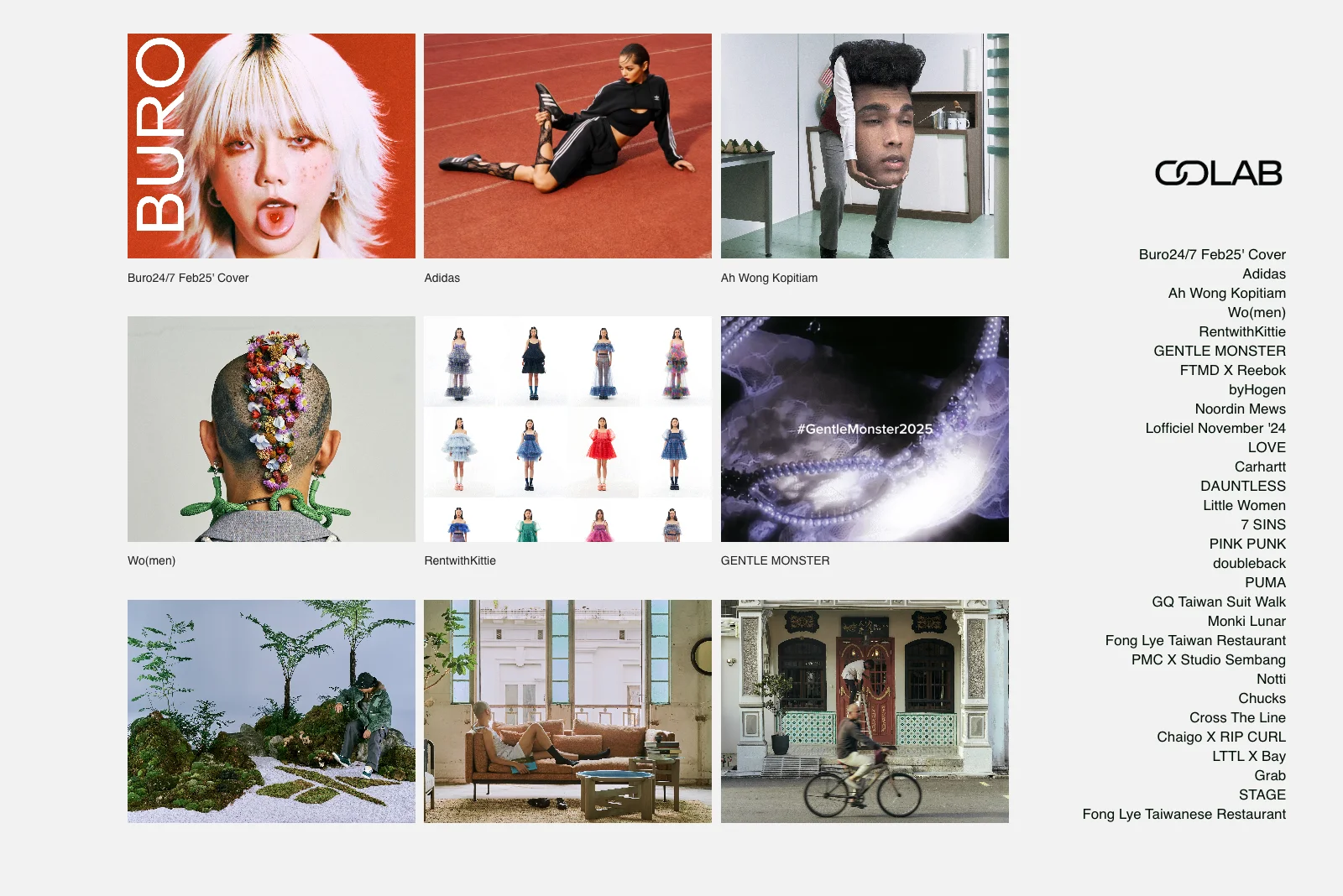
Adobe Portfolio Theme: Sawdust
lo-bach shoots commercial and editorial photography with clients including Adidas, PUMA, and Carhartt. The standout detail is one that most photographers don't think to use: animated GIF previews on select project thumbnails.
Where a static thumbnail shows a moment, a GIF loop shows a sequence. For editorial and lifestyle photography that involves movement, multiple setups, or behind-the-scenes storytelling, a short loop communicates range and energy that no still image can. It's a subtle differentiator that makes a grid feel alive without requiring any custom development.
The rest of the portfolio is clean and direct. The GIFs don't feel gimmicky because they're used selectively, only where the work benefits from them.
What to steal: Add animated GIF previews to projects where your work involves sequences, editorial stories, or motion. Used sparingly, it's one of the highest-impact ways to differentiate a photography portfolio on any standard grid layout.
6. Mambaphoto
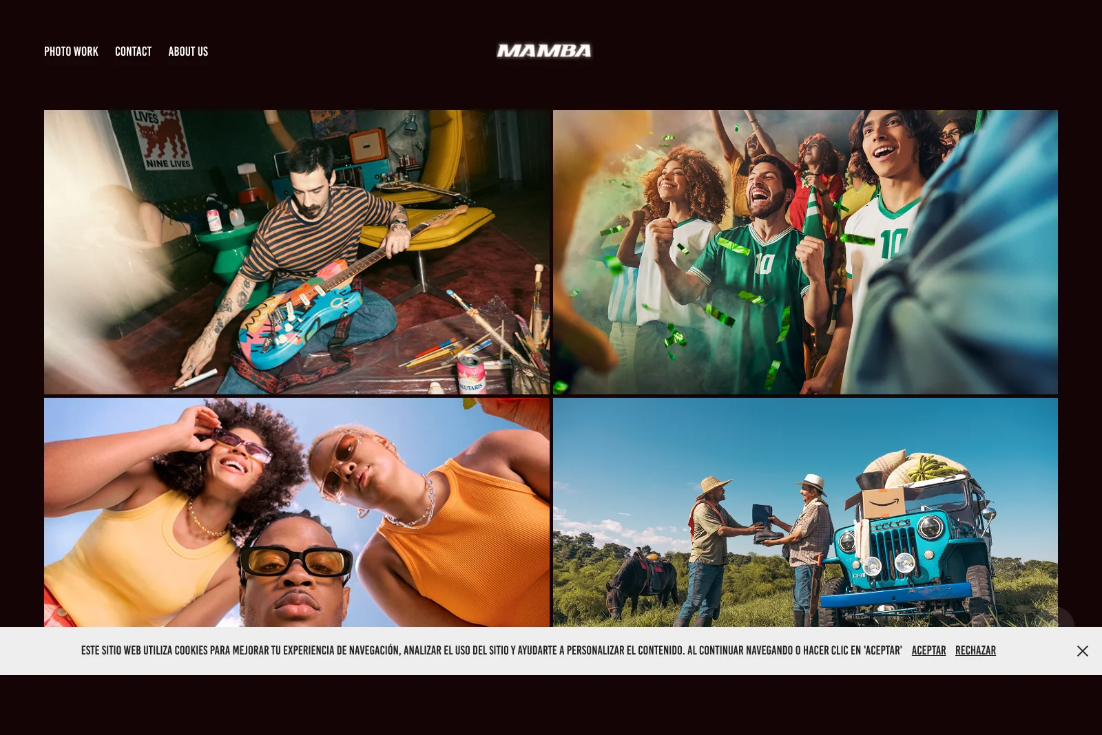
Adobe Portfolio Theme: Marina
Mambaphoto is a commercial photography studio based in Colombia, with a client list that spans Smirnoff, Club Colombia, Amazon, Uber, and Audi alongside significant work in music video production and documentary photography. The portfolio demonstrates something that photographers working outside of New York, London, or Los Angeles often hesitate to do: lead with your geography.
The work is clearly rooted in Latin American markets. Brands like Alpina, Banco Promerica, and Acción Contra el Hambre sit alongside international names. Rather than minimizing that regional identity, the portfolio embraces it. The result is a studio that brands targeting Latin American audiences can identify as uniquely positioned to serve them.
The Marina theme gives the grid a clean, editorial weight that suits the scale of the commercial work inside it.
What to steal: If you have regional depth, position it as an advantage rather than a limitation. For commercial photographers, local market fluency is a differentiator that clients from outside the region actively look for.
The best adobe portfolio resource ever made.
Download Your Copy Today →Download Your Copy Today ↓
Stop Googling
“Adobe Portfolio Examples.”
I found 40 of the best ones just for you.
- 40 real professional portfolios
- Home, About, Project Pages Inc.
- One focused theme per site
- 40x Steal-This Ideas
- Free — instant delivery
- Branding
- UX + motion
- 3D + illustration
- Photography
- Editorial
- Real designer testimonials
- Any Creative Cloud plan
- Instant delivery
- Unsubscribe anytime
- 40 real professional portfolios
- Home, About, Project Pages Inc.
- One focused theme per site
- 40x Steal-This Ideas
- Free — instant delivery
- Real designer testimonials
- Any Creative Cloud plan
- Branding
- UX + motion
- 3D + illustration
- Photography
- Editorial
- Instant delivery
- Unsubscribe anytime
7. Xinjin Zhao
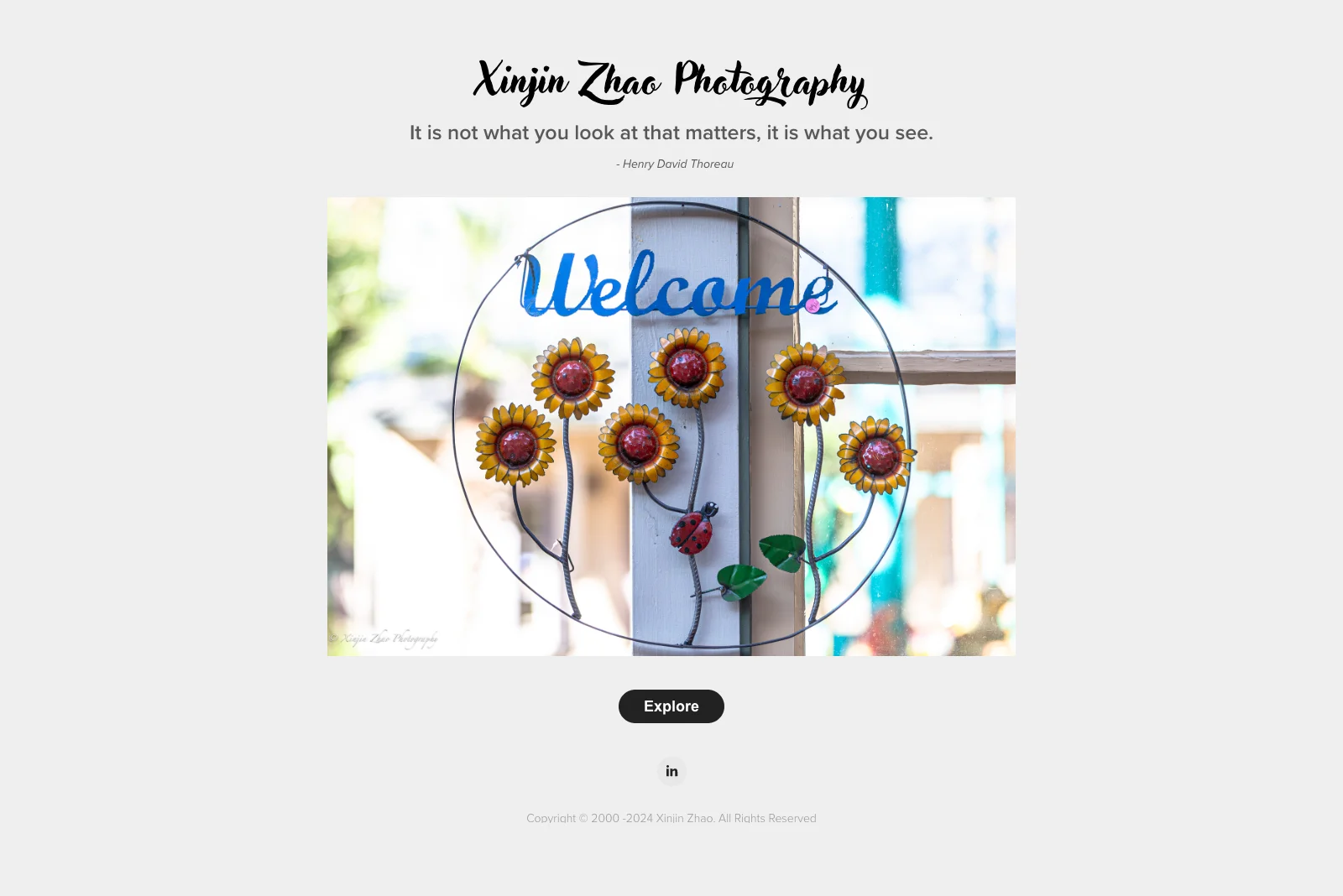
Adobe Portfolio Theme: Sawdust
Xinjin shoots landscape photography, and his portfolio opens with a single line before you see a single image: "It is not what you look at that matters, it is what you see." Thoreau.
That quote is doing structural work. It frames every landscape that follows as an act of seeing rather than documenting. By the time you reach the photographs, you're primed to look differently at them. The images haven't changed. Your relationship to them has.
The rest of the portfolio is minimal by design. A large hero image, a clean Explore prompt, and then the work. Nothing competes with that opening framing.
What to steal: Consider what you want visitors to feel before they see the first image. A short quote, a one-line philosophy, or a single strong sentence can prime your audience in a way that changes how they experience everything that follows. Adobe Portfolio lets you add text modules anywhere on a page.
What These Photography Portfolios Have in Common
After looking at dozens of photography portfolio websites on Adobe Portfolio, a few patterns show up consistently in the ones that actually work.
They made one strong presentation decision and committed to it. Hugo chose dark backgrounds. Pablo chose strict niche editing. Xinjin chose a philosophical opener. Don chose metadata. None of these are complicated choices. All of them required commitment.
They treat the grid as a first impression, not a filing system. Every photographer on this list chose their thumbnails with intention. The right crops, the right resolution, images that communicate the work at a glance. The grid is your handshake.
They edited toward what they want to shoot next. None of these portfolios show everything. They show the best of what the photographer wants to be hired to do more of. For commercial photographers, that specificity is what makes clients feel like they found the right person.
The Sawdust theme dominates for good reason. Four of these seven portfolios use Sawdust. It is the most versatile theme for photography-heavy work, with clean grid layouts, strong image scaling, and minimal UI that gets out of the way of the images. If you're unsure where to start, Sawdust is the answer.
Ready to Build Yours?
If these examples have you ready to launch your own Adobe Portfolio, good. That's the point.
The platform is already in your Creative Cloud account. The photographers above aren't using anything you don't have access to. The difference is knowing how to set it up the right way from the start.
I put together a mini course that walks you through the entire Adobe Portfolio setup, from picking the right theme for your work to getting your site live, with the goal of having your portfolio up within 24 hours of starting.
Get the Adobe Portfolio mini course →
And if you want to understand the platform before diving in, start with my full Adobe Portfolio review, an honest breakdown of what it does well and where to set your expectations.
Looking for more portfolio inspiration? Check out the best Adobe Portfolio themes to find the right starting point for your work.

Jon Sorrentino
Jon Sorrentino is a fractional design partner with digital product and brand experience at PepsiCo, VICE Media, and Barstool Sports. He runs a solo design studio working with Series A and B startups on product design, web design, and brand strategy. He enjoys writing about the intersection of AI and Design and the decisions that separate good design from design that performs for businesses.
Want help building this out for your site? I work with founders and small teams to get the fundamentals right, fast.
Let's talk