
How to Use Adobe Portfolio: 5 Features That Make Your Portfolio Stand Out
Most designers use 20% of what Adobe Portfolio can do. Here are the 5 features worth knowing — with step-by-step instructions for each — so your portfolio looks better than everyone else's.
Most designers who use Adobe Portfolio are only using about 20% of what the platform can actually do.
The result is a portfolio that works — but looks like everyone else's. Same default spacing, same missing context on project pages, same flat layout that doesn't do justice to the work inside it.
The five features below are the ones I see designers consistently miss. None of them are hidden or complicated. They're just not obvious from the default setup — which is exactly why most people skip them. Setting up each one takes minutes and the visual difference is significant.
I've built with Adobe Portfolio, taught it, and watched hundreds of designers navigate it. These are the features I walk through with every designer who asks why their portfolio looks unfinished despite having strong work in it.
If you're new to Adobe Portfolio and want the full setup walkthrough, check out the Adobe Portfolio mini course — it covers everything from theme selection to launch in one structured guide.
1. Create Text Style Guides Before Adding Any Content
This is the single highest-leverage thing you can do before you start building your portfolio — and almost nobody does it.
Adobe Portfolio lets you define text styles once and reuse them across every page. Set your heading font, size, weight, and color once, and it applies consistently everywhere without manual adjustment. This doesn't just make your portfolio look more professional — it dramatically speeds up the build process because you're not restyling text every time you add a new page or project.
Designers who skip this step spend hours making manual adjustments to get type looking consistent. Designers who set it up first build faster and end up with a more cohesive result.
How to set up text styles in Adobe Portfolio:
- Add a text block to any page and type some copy
- Highlight the copy to reveal the edit panel
- Click the left dropdown menu in the edit panel
- Select "Edit Text Styles"
- The left panel opens showing all text style categories — headers, subheaders, paragraphs, captions, and text links
From here, set your typeface, size, weight, and color for each style category. Every time you add a text block to any page, your defined styles will be available and consistent.
Pro tip: Do this before adding any project content. Retrofitting text styles to existing content is significantly more work than setting them up first. Fifteen minutes at the start saves hours later.
2. Use Multiple Column Layouts on Project Pages
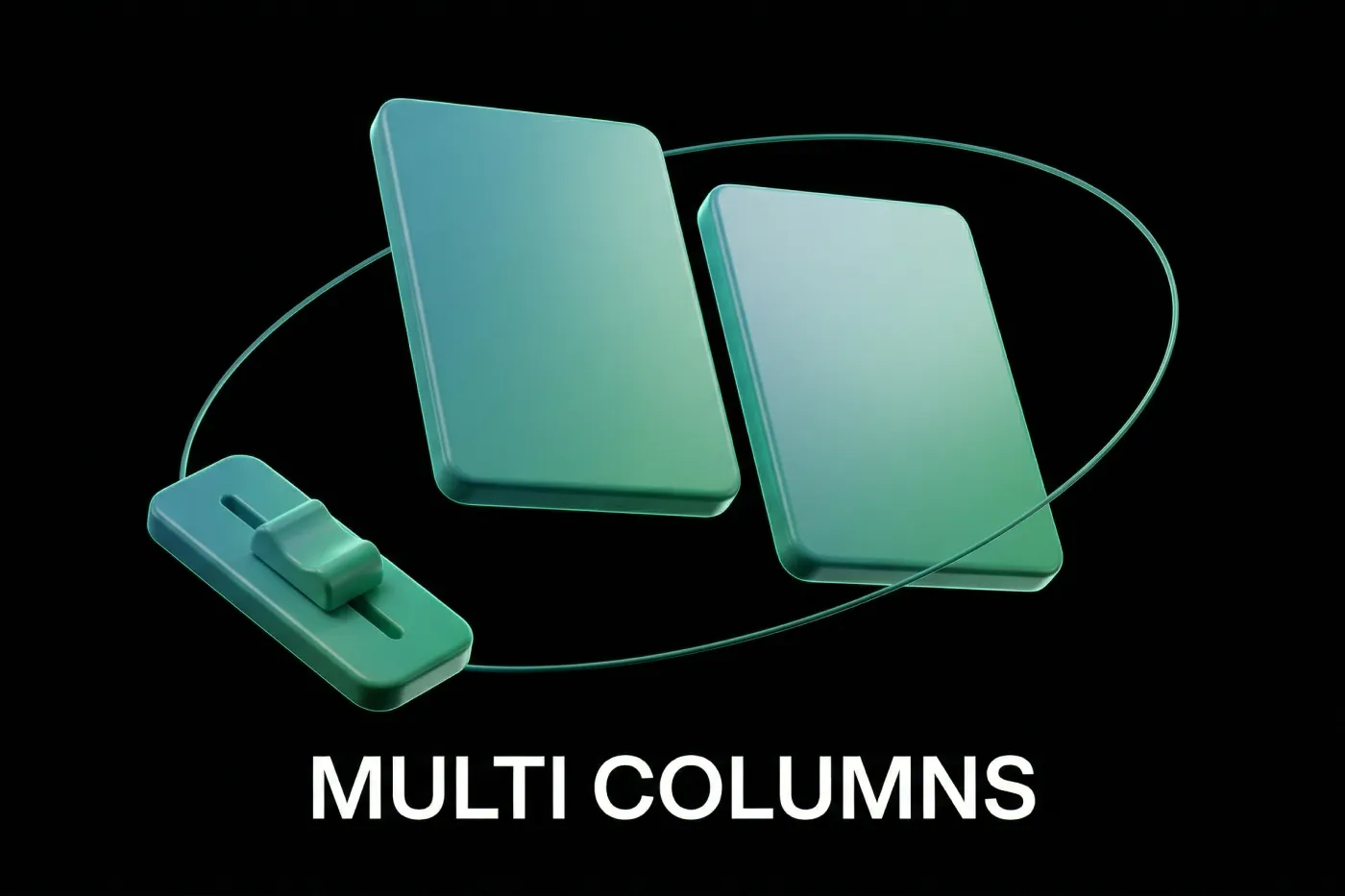
The difference between a portfolio that looks like a gallery dump and one that looks like a case study almost always comes down to layout. Specifically, whether project pages use single-column image stacks or multi-column layouts that pair visuals with context.
Adobe Portfolio supports multi-column layouts natively — but it's not obvious how to activate them, which is why most designers never do. Columns let you place descriptive text alongside images, create visual breathing room with intentional negative space, and show process thinking rather than just finished work. Hiring managers and clients make decisions based on whether they understand your design thinking — and multi-column layouts make that thinking visible.
How to add multiple columns in Adobe Portfolio:
- Add a text block or image to your page spanning the full width
- Hover over the left or right edge of the block until a blue plus icon appears
- Click the blue plus to reveal a menu of block types to add alongside
- Select your desired block type to create a two-column layout
- Hover over the dividing edge between columns to adjust the width ratio of each side
Where to use this: The most effective placement is beside images that need context — mockups with no visible brief, process images that need explanation, or final work where you want to surface the problem you were solving. A 60/40 or 70/30 split with the image larger and the description beside it reads naturally on both desktop and mobile.
3. Embed YouTube or Vimeo Videos for Motion Work
Adobe Portfolio allows direct video uploads up to 1GB through the editor. For most short screen recordings or motion clips, this works fine. But if your video content is larger than 1GB — higher quality exports, longer reels, or compressed-but-still-large files — you'll want to host on YouTube or Vimeo and embed the player instead.
This isn't a workaround. It's actually the better approach in most cases. YouTube and Vimeo hosting means your video loads faster for visitors, handles adaptive quality based on their connection, and doesn't eat into your Adobe Portfolio storage. The embed player also looks more professional than the default Adobe Portfolio video player.
How to embed a YouTube or Vimeo video in Adobe Portfolio:
- Add an embed block to your page — it appears as a grey rectangle placeholder
- Hover over the embed block to reveal a blue tab with an arrow in the top left corner
- Click the arrow and select "Edit Embed Code"
- Go to your YouTube or Vimeo video, click Share, and copy the embed code
- Paste the embed code into the field and click Save
One important fix: The default embed code usually sets the video height to 100%, which looks broken on most page layouts. Change the height value in the embed code to 400px — this works reliably across desktop and mobile and gives the player a clean, professional appearance without requiring custom CSS.
4. Build Custom Contact Forms Beyond the Default Fields
The default Adobe Portfolio contact form collects a name and email address. For most designers, this is fine. But if you want to qualify leads before they reach you — understanding what kind of project they need, their timeline, their budget range, or how they found you — Adobe Portfolio lets you add custom fields to your contact form.
This is one of the most underused features on the platform. Custom form fields mean that every inquiry that reaches your inbox comes with useful context, which saves back-and-forth and helps you respond more specifically. For designers who are beginning to think about positioning and client qualification, this is a meaningful upgrade over the default form.
How to add custom fields to your Adobe Portfolio contact form:
- Add a contact form block to your page
- Hover over the contact form to reveal the blue dropdown arrow in the top left
- Click the dropdown and select "Customize"
- In the customization panel, add new fields or toggle existing fields on and off
- Click Done when satisfied
What fields are worth adding: Project type (dropdown), timeline (dropdown), and "How did you find me?" (short text) are the three I recommend for most designers. They're low friction for the visitor but give you valuable intake information. Toggle them on for your main contact page and off for any secondary contact forms on specific project pages where the context is already established.
5. Sync Your Adobe Portfolio to Behance

One of the strongest reasons to use Adobe Portfolio over other platforms is its native integration with Behance. Once your portfolio is built and your projects are added, you can sync everything to Behance with a single toggle — no manual re-uploading, no reformatting, no starting from scratch.
Behance has a large, active audience of creatives, hiring managers, and clients actively browsing for talent. Having your work on both your own portfolio domain and Behance simultaneously means you're discoverable in two places at once without doing the work twice. For early-career designers building visibility, this compounded exposure has real value.
How to sync Adobe Portfolio to Behance:
- Complete your portfolio first — add all projects and finalize your content before syncing
- In the Adobe Portfolio editor, click "Integrations" at the top of the left sidebar
- Select the Behance tab and click the toggle to enable the sync
- Adobe Portfolio will begin syncing all projects to your Behance profile automatically
One thing to check after syncing: Review your projects on Behance after the sync completes. Spacing and layout can occasionally shift during the sync process — most projects transfer cleanly but it's worth a quick review before sharing the Behance link anywhere.
What These Features Have in Common
None of these are advanced. None of them require design or coding knowledge. They're the features that separate a portfolio that was clearly set up by someone who knew what they were doing from one that looks like a first attempt.
Text styles make everything consistent. Multi-column layouts make your thinking visible. Video embeds make motion work look professional. Custom contact forms make your intake smarter. Behance sync doubles your exposure without doubling your work.
Taken together, they add up to a portfolio that communicates more than just "here's my work" — one that shows how you think, how you work, and how you want to be hired.
Get the Full Setup Guide
If you want to go deeper than these five features — covering theme selection, page structure, project organization, and getting your portfolio live from scratch — that's exactly what the Adobe Portfolio mini course covers.
The goal is straightforward: from blank page to live portfolio in 24 hours.
Get the Adobe Portfolio mini course →
Already decided on Adobe Portfolio and want to make sure you're using the right theme? Check out the best Adobe Portfolio themes for graphic designers.
Want to see what's possible? Browse the best Adobe Portfolio examples from real designers.
Still deciding if it's the right platform? Read Is Adobe Portfolio Right for You before committing.

Jon Sorrentino
Jon Sorrentino is a fractional design partner with digital product and brand experience at PepsiCo, VICE Media, and Barstool Sports. He runs a solo design studio working with Series A and B startups on product design, web design, and brand strategy. He enjoys writing about the intersection of AI and Design and the decisions that separate good design from design that performs for businesses.
Want help building this out for your site? I work with founders and small teams to get the fundamentals right, fast.
Let's talk