
In the graphic design industry, your portfolio isn't just a collection of works—it's a representation of you as a designer. This digital space, so deeply intertwined with your professional identity, can be the deciding factor between landing that dream client or being passed over. Adobe Portfolio has become the go-to platform for many and with good reason. Bundled with any Adobe subscription, it offers a seamless integration for designers to display their portfolios. Yet, in my extensive review of over 100 design portfolio websites, I found that a staggering 29% of designers, despite using Adobe Portfolio, don't fully capitalize on its potential. Their portfolios, while functional, lack the captivating visual appeal that draws clients in.
Now, I understand the pressure. Crafting a portfolio website that's both aesthetically stunning and effectively communicates your skills is no small feat. But it's an endeavor worth every ounce of your creative energy. After all, in an industry where first impressions are often lasting ones, your portfolio can be the golden ticket to high-caliber, lucrative engagements. That's why I've curated this list, spotlighting the crème de la crème of Adobe Portfolio examples. Let these examples get your creative juices, guiding you to create a portfolio website that not only showcases your talents but also stands as a testament to your dedication and passion for design.
Best Graphic Design Portfolios on Adobe Portfolio
1. Julius Cruickshank

Julius's portfolio stands out as a fresh breath of minimalism. While many designers are caught in the whirlwind of trying to showcase everything they've got, Julius understands the value of keeping things simple and drawing attention to the essence of his work. A quick glance at his homepage reveals his meticulous eye for detail; the rounded corners of project thumbnails are a delightful touch, exuding both sophistication and a hint of playfulness. What's more, these thumbnails are spaced just right, creating a harmonious rhythm that invites viewers to explore further.
Diving into his project pages and you're greeted with an impeccable use of multiple column layouts and negative space. Julius harnesses these design elements brilliantly, ensuring a smooth, legible, and engaging scrolling experience through his case studies. His restrained use of motion within images amplifies their impact without distracting from the content. Furthermore, Julius's choice of typefaces is commendable. He's opted for neutral tones, allowing his stellar work to take center stage without any typography overshadowing it. In essence, Julius's portfolio is not just a display of his projects but a testament to his keen understanding of design principles and user experience.
Adobe Portfolio Theme: Ludwig
View Julius’s Portfolio Website hHere ->
2. Max Ayalla

Max is a distinguished creative director from Kansas City. Having collaborated with renowned brands like Nike, Hurley, and Under Armour, his portfolio exudes the experience and prowess that have made him a sought-after name in the industry. Immediately upon entering his website, visitors are greeted with a potent combination of bold typeface in the header, unmistakably stamping his identity and profession.
Scrolling down to his homepage, his craftsmanship is evident in the high-quality images chosen as project thumbnails. These visuals, sharp and vibrant, not only give a sneak peek into his works but also showcase the caliber of brands he has associated with. And just when you think you've gotten a handle on his design style, Max throws in a delightful twist. The subtle use of a strikethrough effect to indicate the page or project you're hovering over adds a touch of interactive intrigue, making navigation both intuitive and engaging.
Adobe Portfolio Theme: Marta
View Max’s Portfolio Website Here ->
3. Nora Kaszanyi

Nora's portfolio is a masterclass in design harmony. As you land on her homepage, you're immediately drawn into a realm where design seems both expansive and meticulously curated. The generous use of negative space juxtaposed with purposefully scaled images makes each piece of her work feel not just viewed, but truly revered. Nora's conscious decision to use scale in this manner accentuates the importance and depth of each project she's undertaken.
The header of Nora's portfolio is nothing short of captivating. Featuring a video reel that plays gracefully in the background, it instantly immerses visitors into the depths of her creativity. Thoughtfully, Nora places her name and title aligned to the right, ensuring that the reel remains unobstructed. Her navigation is laudably straightforward, effortlessly guiding users between her work gallery, contact form, and an impressive About page. Speaking of which, her About page is truly a standout. Nora's robust layout encapsulates not just a bio, but a window into her accolades and features. It’s a testament to her depth and breadth as a designer. My favorite part is her choice of typeface. Employing variations in weight, Nora establishes a clear, pleasing hierarchy throughout her portfolio, weaving every page into a cohesive tapestry of design excellence.
Adobe Portfolio Theme: Marta
View Nora’s Portfolio Website Here ->
4. Romain Ferrer

Romain’s decision to plunge into a monochromatic blue theme is both audacious and mesmerizing. This singular hue washes over the entire site, imparting a consistent visual narrative. Right from the get-go, as you navigate to his homepage, the array of project thumbnails immediately strike a chord — each one adapted to this signature monochrome blue. It's a refreshing departure from the norm, showing that simplicity can indeed have its own shades.
But Romain's mastery doesn't stop there. As you hover over each project, a pastel pink hue emerges, introducing a delightful contrast. This choice of color palette, seemingly unusual at first, actually complements the overarching blue theme, lending both vibrancy and depth. While one might assume that such a dominant background color could clash with diverse project imagery, Romain astutely avoids this pitfall. The blue hue he's chosen doesn't overpower. Romain subtly introduces drop shadows on his project images, ensuring that images stand pronounced against the background. This subtle treatment is more than just an aesthetic choice; it’s a nod to his profound understanding of design layers and depth.
Adobe Portfolio Theme: Thomas
View Romain’s Portfolio Website Here ->
5. Bita Goli

Bita's portfolio radiates a unique blend of creativity and precision. Her use of the Andreas theme, a choice often deemed tricky by many, is a testament to her impeccable design sensibilities. Where others often falter, Bita soars — maintaining a seamless alignment of her text to the left, while her thumbnails alternate sides. This meticulous attention to detail not only enhances legibility but also provides a rhythmic visual cadence, elevating the overall experience.
As one navigates her homepage, the delight of discovery emerges. Hovering over some of her thumbnails reveals a secondary image, a design choice that adds depth and dimension. These captivating transitions don't just intrigue; they beckon the viewer deeper into her world of design. The allure is further amplified by her choice of high-quality images for these thumbnails. Each image, sharp and vibrant, serves as a window into her design philosophy, showcasing her commitment to quality and aesthetic brilliance.
Adobe Portfolio Theme: Andreas
View Bita’s Portfolio Website Here ->
6. Ragnar Freyr

Ragnar's distinct visual flair is evident from the moment you step into his digital realm. Ragnar's forte in crafting icons, logos, and illustrations isn't just a skill—it's an art form, and his homepage thumbnails are a powerful testament to this. Each one resonates with his unique style, serving as an unmistakable signature of his craft.
But what truly sets Ragnar apart is his mastery of minimalism. While some might crave more in-depth descriptions and context around projects, Ragnar lets his work take center stage, allowing it to speak volumes on his behalf. The essence of his designs doesn't lie in words but in the very textures, colors, and patterns he employs. This calculated restraint isn't an oversight—it's a strategy. It showcases his profound understanding of visual communication. Where words might falter, Ragnar's designs communicate seamlessly, encapsulating his ideology of conveying profound messages with intentional, concise efforts.
Adobe Portfolio Theme: Thomas
View Ragnar’s Portfolio Website Here ->
7. Jacob Tejlmand

Jacob's portfolio resounds with the essence of a designer who knows the heart and soul of branding. The magic begins right at the header section, where he introduces himself with a display of large type that brilliantly displays his comprehension of hierarchy.
Jacob’s homepage adopts an unconventional yet impactful approach. Contrary to the typical parade of multiple projects, he opts to spotlight only three selected pieces. It's a bold move, one that underscores his confidence in the depth and caliber of his work. This curated presentation serves a dual purpose — it offers visitors a distilled taste of his expertise while ensuring they aren’t overwhelmed. Yet, for those with an appetite for more, Jacob thoughtfully directs them to a separate work page, unveiling the expanse of his creativity.
Jacob’s 'About' page is also a great example of his skill. He employs a multi-column layout, interspersed with ample negative space, creating an inviting ambiance. This space gracefully houses his bio, illuminating insights into his design philosophy, and a showcase of the services he offers. Every element feels intentional.
Adobe Portfolio Theme: Thomas
View Jacob’s Portfolio Website Here ->
8. Madison Shackell-York

Madison's portfolio is an example of class, refinement, and a keen eye for detail. Her portfolio website, you are met with a simplistic approach that reduces noise, and spotlights the quality of Madison’s work. The thumbnails are carefully curated, showcasing not just high-resolution imagery, but also intriguing layouts that invite you to dive deeper into each project.
As soon as one enters one of her project pages, the adventure continues without interruption. A high-resolution header image at the top of each page establishes the mood for the carefully curated case-study of Madison's work. It is clear that Madison has talent for telling stories visually. While some images stretch full-bleed, some provide nice contrast with generous gutters, giving each image its moment of spotlight.
In Madison’s portfolio, every element, every image, and every layout choice is a testament to her profound understanding of aesthetics and the intricate art of storytelling through design.
Adobe Portfolio Theme: Lukas
View Madison’s Portfolio Website Here ->
9. Sebastian Onufszak

Sebastian is an award-winning creative in illustration, design, and art-direction. One glance at Sebastian's portfolio website, and you're immediately drawn into his creative world. His portfolio website design is intentionally minimalist, a deliberate choice that ensures nothing overshadows his work. It's a canvas where his projects do all the talking. His thumbnails, brimming with bright color palettes and a medley of techniques, are not just visual treats but gateways into deeper narratives. Sebastian’s portfolio website is a great example of how your design portfolio website should be a platform for you work to speak volumes.
Adobe Portfolio Theme: Thomas
View Sebastian’s Portfolio Website Here ->
10. Paul Kirschvink

As a digital designer and art director hailing from Germany, Paul’s portfolio website marries form with function. It starts with the discernible choice of typeface, a nod to his German heritage, and then into an exemplary demonstration of hierarchy and an intricate understanding of the grid system.
Upon visiting Paul’s homepage, one can't help but appreciate the additional details Paul introduces. Beyond showcasing stunning imagery, he has added in pertinent project details—such as the services provided and the client's name. This inclusion doesn’t just add depth to the visuals but also offers a comprehensive understanding of the scope and context of each project.
Venturing into his project pages, Paul deftly harnesses the features Adobe Portfolio offers, particularly the photo grids. These grids capture various facets of his campaigns and adding layers to the viewer’s experience. What makes Paul’s portfolio truly stand out is his strategic placement of headings, intertwined within his projects, providing insights into his creative process.
Adobe Portfolio Theme: Andreas
View Paul’s Portfolio Website Here ->
11. John Olson
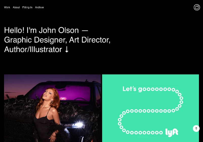
If this list is any indicator that simplicity can be a powerful tool John's design portfolio website echos that sentiment. From the outset, visitors are immediately captivated by the expansive, high-resolution imagery – a candid display of his commendable work at Lyft. They serve as powerful anchors, drawing viewers into the depth and breadth of his expertise.
Venturing deeper into the project pages, John’s design prowess becomes even more evident. The use of high-quality mockups stands as a testament to his meticulous attention to detail. When not showcasing these, he effortlessly shifts the narrative to highlight his contributions in photography and art direction. In an era where portfolios often run the risk of being overly elaborate, John’s stands out, championing the notion that, sometimes, the most profound statements are made with simplicity and clarity.
Adobe Portfolio Theme: Marina
View John’s Portfolio Website Here ->
Want to Master Adobe Portfolio for Your Portfolio Website?
After seeing the amount of graphic designers and creatives that use and struggle with Adobe Portfolio. I decided to put together a free mini course to help walk you through the ins and outs of the platform so you can create a stunning design portfolio website.
This mini course features 4 short video lessons that will walk you through:
- How to use text-styles for easy formatting.
- Creating multiple column layouts for your project pages.
- Adding rico-media elements like videos and forms.
- Customizing your selected tema.
- And much more!
If you want to master Adobe Portfolio today you can sign up for the free mini course here.


